
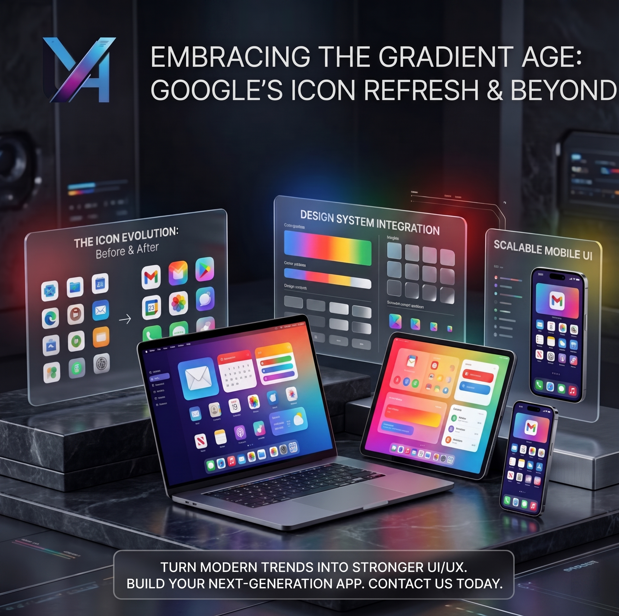
Google’s new gradient icon design is coming to more apps
A branding shift worth watching
Small visual details often shape first impressions faster than people realize. An icon lives on home screens, browsers, dashboards, launch pages, and product listings. That means icon design is not just decoration. It is part of product strategy, brand recognition, and quality perception.
In fast-moving digital markets, design trends often start small before they become standard. A subtle logo change, a new motion system, or a refreshed icon style can signal a much bigger shift in how brands want to be seen. That is why Google’s gradient icon direction matters. It suggests that visual identity is becoming more dynamic, more expressive, and more tied to the emotional feel of modern products.
For many years, app icons were treated mostly as simple markers. They helped users find an app quickly, recognize a service, and separate one product from another. That basic role still matters. But today, icons do more than label software. They help communicate quality, tone, style, and how current a product feels in the market.
What Google’s gradient icon direction means in simple words
In simple terms, gradient icon design means moving away from flatter and more rigid color blocks toward softer blends, richer tones, and a more fluid visual identity. It creates icons that can feel more premium, more modern, and sometimes more emotionally alive.
When a major company like Google moves in this direction, it becomes a strong signal for the wider design world. It suggests that app branding is shifting beyond strict minimalism and into something more expressive. The icon is still supposed to be clear and recognizable, but it now also needs to feel fresh, polished, and aligned with the broader personality of the brand.
This matters even more in an AI-era product landscape where brands are trying to look innovative without becoming visually confusing. A gradient can help a product feel more energetic and more current, but it only works well when clarity and structure are still protected.
Why icon design matters more than many businesses realize
Many businesses underestimate the role of icons because they seem small. But users see icons constantly. They show up in app stores, mobile home screens, desktop docks, tabs, menus, notifications, marketing materials, and product ecosystems. That repeated visibility gives them a lot of power.
A strong icon can make a product feel established before the user even opens it. A weak or outdated icon can quietly suggest the opposite. People do not always explain these reactions out loud, but they feel them. That is why app icon design trends matter. They reflect changing expectations around quality and brand maturity.
Why icons still matter in modern products
- they shape first impressions quickly
- they support recognition across devices and platforms
- they help products feel more polished and trustworthy
- they strengthen visual consistency inside a design system
- they influence how modern or outdated a brand appears
How gradient icon design changes brand perception and product feel
Gradients can add depth, softness, and motion-like energy to a brand without relying on complex illustration. When used well, they make products feel more expressive and more current. They can suggest creativity, intelligence, speed, flexibility, or a premium digital finish.
This is especially important in app branding because modern users often judge products in seconds. A flat or older icon system may still be functional, but it can sometimes feel less alive than the rest of the market. A refined gradient direction can refresh that feeling and make the brand seem more in step with modern design culture.
But the goal is not to add gradients just because they are trendy. The real value comes when the visual system remains easy to recognize. Strong branding still depends on memorability, contrast, clean shapes, and consistency. The gradient becomes helpful when it supports those things rather than distracting from them.
The design lesson is simple:
modern app branding needs to feel both clear and expressive. Users want recognition, but they also respond to visual systems that feel polished, current, and emotionally stronger.
Why modern app branding now needs more clarity and personality
As more apps compete for attention, visual sameness becomes a problem. Brands that look too generic are harder to remember. At the same time, brands that become too decorative can lose clarity. The challenge is finding the right balance between personality and usability.
This is why modern app branding is becoming more strategic. It is no longer enough to have a logo, a color, and a few screens that look nice. The brand has to work across icons, interface elements, motion, product marketing, presentation assets, and cross-platform experiences. A good visual identity system holds together in all of those places.
For startups and growing teams, this is especially important. A product launch often depends on how quickly people understand what the brand is and whether it looks trustworthy. Strong icon design can help that happen faster. It gives the product a more finished presence from the first glance.
What this means for startups, product teams, and digital brands
For startups, Google’s gradient icon trend is a reminder that branding should not be treated as a last-minute layer. It shapes perception from day one. A clean, memorable, and modern icon system can make a young product look more serious and more prepared for the market.
For product teams, this is also a signal to revisit older visual systems. If the brand still works well, it may only need refinement. But if the icon feels dated or inconsistent across platforms, that can weaken the overall product feel. Small visual problems can quietly damage the sense of quality.
For established businesses, the lesson is broader. Branding systems now need to support mobile app icons, web app branding, design system refreshes, and cross-platform consistency at the same time. The visual identity cannot live in one place anymore. It has to travel well across the full digital experience.
Where stronger icon and brand systems help most
- mobile app icons that need quick recognition
- web app branding that should feel modern and credible
- startup product launches that rely on fast trust-building
- design system refreshes for growing products
- cross-platform brand consistency across digital touchpoints
How UxionApps helps build visually strong and future-ready digital products
At UxionApps, we see branding and usability as part of the same product quality story. A strong digital product should work well, feel clear, and look intentional in every visible layer. That includes interface structure, brand language, icon systems, layout consistency, and the small details that shape trust.
We help businesses create modern UI UX and scalable digital products that feel current and visually strong. That means building with both usability and visual identity in mind, so the product does not just function well. It also feels refined, memorable, and aligned with where design expectations are going.
For brands that want to refresh older interfaces or launch new digital products with stronger design presence, this matters a lot. The market is moving toward more expressive but still disciplined visual systems. Teams that respond well to that shift can stand out more clearly.
Final thoughts
Google’s gradient icon shift matters because it points to a broader change in app branding. Icons are no longer just functional labels. They are becoming part of a larger product experience that carries emotion, polish, and identity.
Gradient icon design is not automatically the right answer for every brand. But the design direction behind it is important. Products now need stronger visual personality without losing clarity. They need branding that works across screens, platforms, and modern expectations.
The businesses that understand this early will be better positioned to build products that feel more current, more memorable, and more competitive. In the future of app branding, even small details are becoming strategic.
Build with UxionApps
Want a digital product that feels modern, clear, and visually stronger?
UxionApps helps businesses build modern UI UX, stronger app branding, and future-ready digital products designed to stand out with clarity and confidence.
